


Posters:
Brand Promotion & Public Awareness
I obtained my image from website app.leonardo.ai.
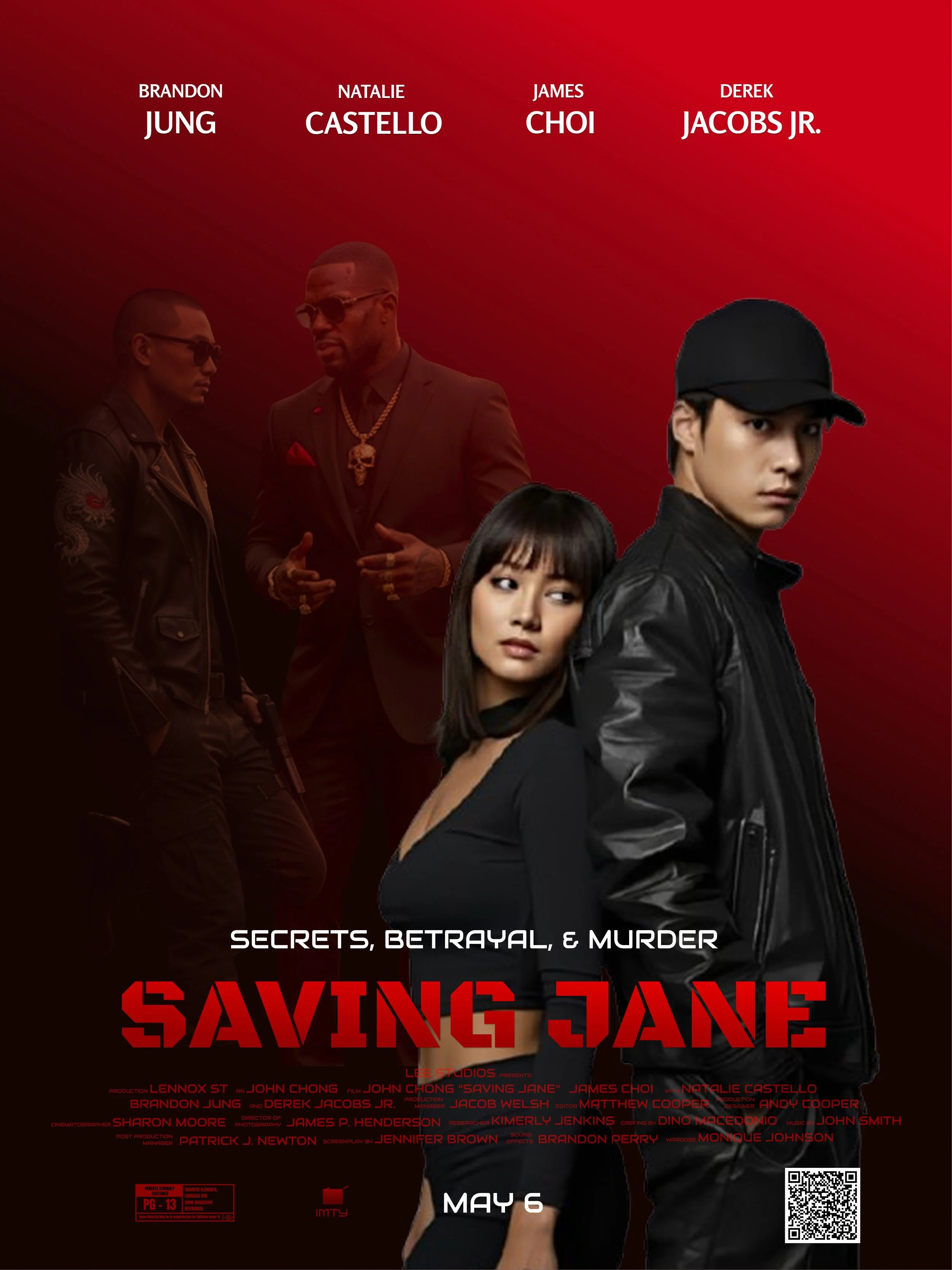
SAVING JANE MOVIE POSTER
BRIEF CONTEXT:
'Saving Jane,' a 2026 psychological thriller movie premiere of a high-stakes narrative theme of perceived protection vs. hidden alliances. While the protagonist believes he is Jane’s sole protector, the visual strategy escalates to a darker turn. In reality, Jane is sinisterly associated with two mysterious figures who, in a final subversion of the genre, are actually working to save him from her - mastermind behind a malevolent scheme. The primary tension stems from the gap between what the protagonist believes (he is saving Jane) and the reality (Jane is the threat).
THE PROBLEM:
The challenge involved designing a poster that conveys a sense of mystery with minimize information. By using Negative Space (White Space) to reduce cognitive load while encouraging viewers to interpret and challenge its meaning independently.
SOLUTION:
A 'Symmetric Distortion' visual theme was implemented by using two figures in the background, representing hidden, perhaps darker motives. This use of proximity suggests a connection of the two larger characters, who serve as the primary visual hierarchy and focal point of the plot. Their ambiguous expressions are left to the audience’s interpretation, further emphasized by the typography of the title.
A functional QR code as a digital touchpoint, was integrated at the bottom right, to allow curious viewers to interact with the mystery and access further plot clues using their mobile.
These themes of duality and psychology, conveyed through the poster's design, are intended to engage the audience intellectually, encouraging independent thought and discussion about each character's true motives and the overall significance of the film.
THE RESULTS:
The focus on 'Duality' and 'Hidden Motives' by using strategic Visual Hierarchy, Proximity, and a functional QR code —is estimated to encourage an increase of 40% in ticket interest among viewers seeking thought-provoking thriller cinema. This is a “threat you don't see coming."
The functional QR code directs users to a concept Figma 'card,' demonstrating my ability to integrate interactive digital elements into print and marketing design."
Digital Specifications: sRGB Color Space | 300 PPI | JPG | 1080 x 1350px (Optimized for Web)
Print Specifications: CMYK Color Space | 300 DPI | 100lb UV-resistant Gloss Coated Cover Stock | 27" x 40" with 0.125" Bleed
TYPOGRAPHY:
Black Ops One
Audiowide
Rosario
COLOR PALETTE:
I obtained my shoe images from website myarchitechai.
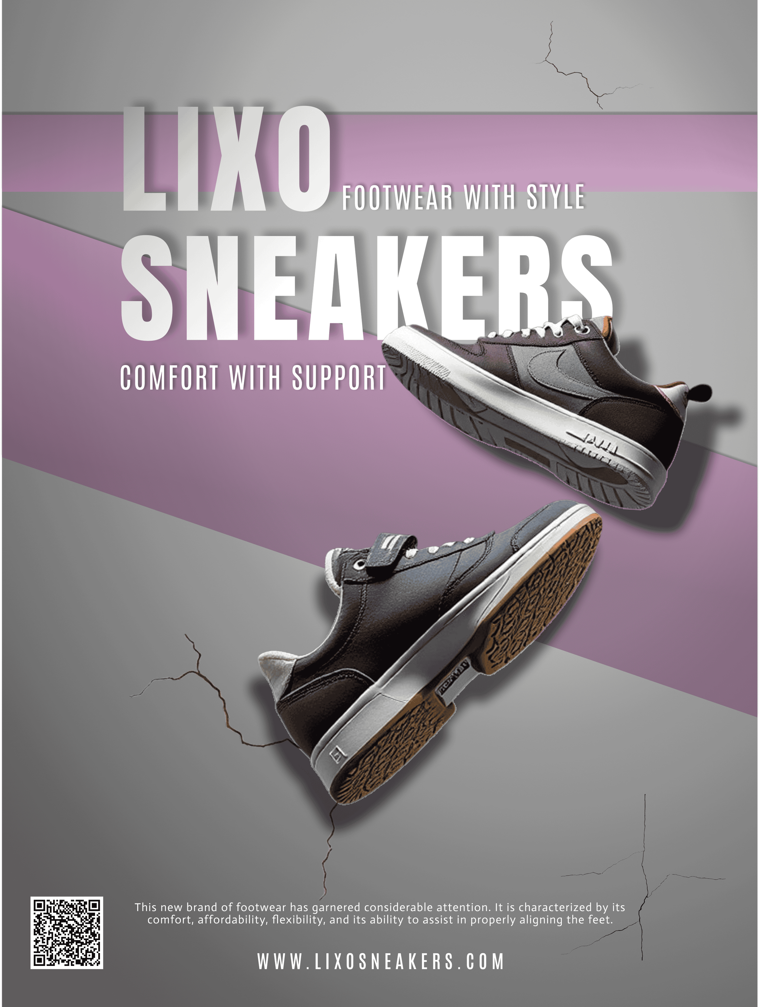
LIXO SNEAKER POSTER
BRIEF CONTEXT:
Lixo Sneakers is a new brand of shoes that emphasizes the use of ultra-lightweight materials and prioritizes orthopedic-grade support, while ensuring the versatility in style that is suitable for all age groups.
SOLUTION:
Visual representation to match the company’s brand and what they stand for was highly implemented in this poster. The shoes are placed using proximity to one another as if they are floating or falling on hard concrete which is now cracked emphasizes the shoes durability.
A bold typeface was selected for the header to establish a clear visual hierarchy, with a tag line that briefly describe the benefits of the shoes. Purple streaks were placed diagonally to give a sense of movement to the project. This choice effectively uses negative space, guiding the viewer's gaze from the brand name at the top directly down to the product and the call-to-action at the bottom.
An alignment was used to provide professional evidence for the brand's orthopedic claims and influence potential customers to go to their site to buy their shoes. A functional QR code is placed at the bottom left of the layout, giving customers a direct way to visit the website using their phone to research more information.
THE PROBLEM:
It was important to break the sigma and challenge the status quo of having shoes that fully support feet but with modern style to compete with other competitors. The question was how may Lixo Sneakers market themselves as reliable and trustworthy, providing healthy footwear suitable for everyday use?
THE RESULTS:
By implemented a functional QR code and using the Visual Hierarchy and Alignment strategy for both of the product and its orthopedic, it is estimated to drive a 45% increase in sales interest. This balances the "urban" aesthetics with clear evidence of comfort; the design successfully converts initial curiosity into consumer trust and intent to purchase.
Digital Specifications: sRGB Color Space | 300 PPI | PNG | 1080 x 1350px (Optimized for Web)
Print Specifications: CMYK Color Space | 300 DPI | 100lb Matte Cover Stock | 24" x 36" with 0.125" Bleed
TYPOGRAPHY:
Anton
Antonio
Actor
COLOR PALETTE:
I obtained my ice cream image from website imyarchitechai and my raspberries image from website Vecteezy.
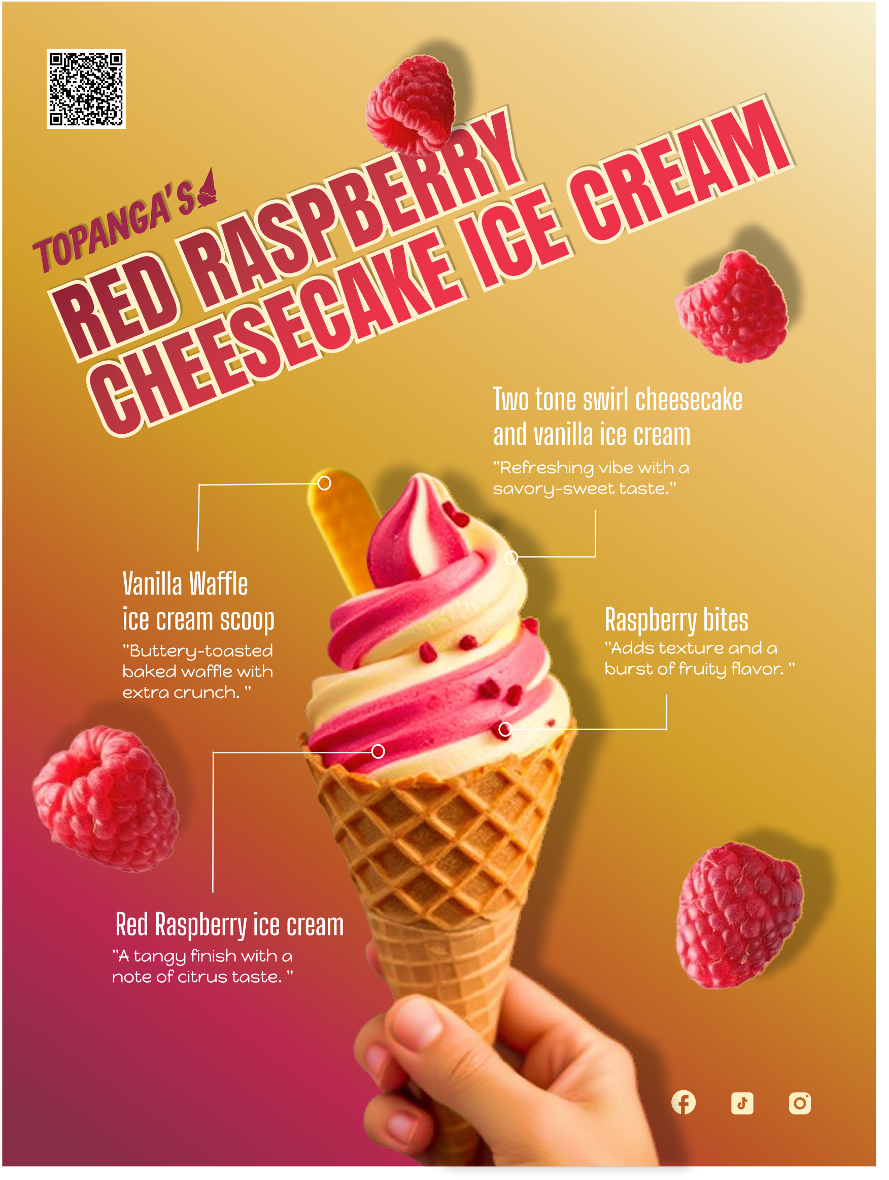
TOPANGA’S RED RASPBERRY CHEESECAKE ICE CREAM POSTER
BRIEF CONTEXT:
Topanga’s Ice Cream had a new flavor they wanted to promote to the public. This new flavor is a delicious ice cream that combines the flavors of creamy cheesecake and sweet raspberry, aiming to targets anyone’s taste palette that like that sweet-savory flavor.
THE PROBLEM:
The challenge was to how to integrate raspberries elements, as visual accents to make the poster more appealing, without compromising the visual hierarchy. It was vital to inform the audience about the Topanga’s new flavor of ice cream while ensuring the product remained the focal point
SOLUTION:
Vibrant colors were chosen to reflect the ingredients in the ice cream. Raspberries were strategically positioned using Proximity to create a biological response, and an attention grabber for the target audience, without cluttering the Negative Space. This gave the poster more “character”.
Adjusting the Leading (line spacing) of these descriptions of the subtle details of what the ice cream consisted of was a great strategy to get people to invest in reading about the new flavor. This will create a sense of anticipation immediately attract the attention of anyone bypassing the poster.
Finally, the Typeface of the title of the flavor stands out even more, due to its scale and angled Grid System as a balance and complementing the raspberry-cheesecake theme of the poster. This overall design makes the design inviting and eye-catching!
A functional QR code was integrated at the top left, once customers scan the QR Code, using their phones, it allows them to get a coupon discount.
THE RESULTS:
The vibrant color palette and strategic visual hierarchy was designed to trigger consumers’ appetite to increase customer purchases. The alignment helped to balance each element on the poster, which is estimated to increase customers’ sales up to 34%. The QR code was the final element which directs users to a concept Figma 'card.'
Digital Specifications: sRGB Color Space | 300 PPI | PNG | 1080 x 1350px (Optimized for Web)
Print Specifications: CMYK Color Space | 300 DPI | 100lb Semi-Glossed Coated Cover Stock | 11" x 17" with 0.125" Bleed
TYPOGRAPHY:
Anton SC
Happy Monkey
Big Shoulder Display
COLOR SCHEME:
I obtained my images from website app.leonardo.ai.
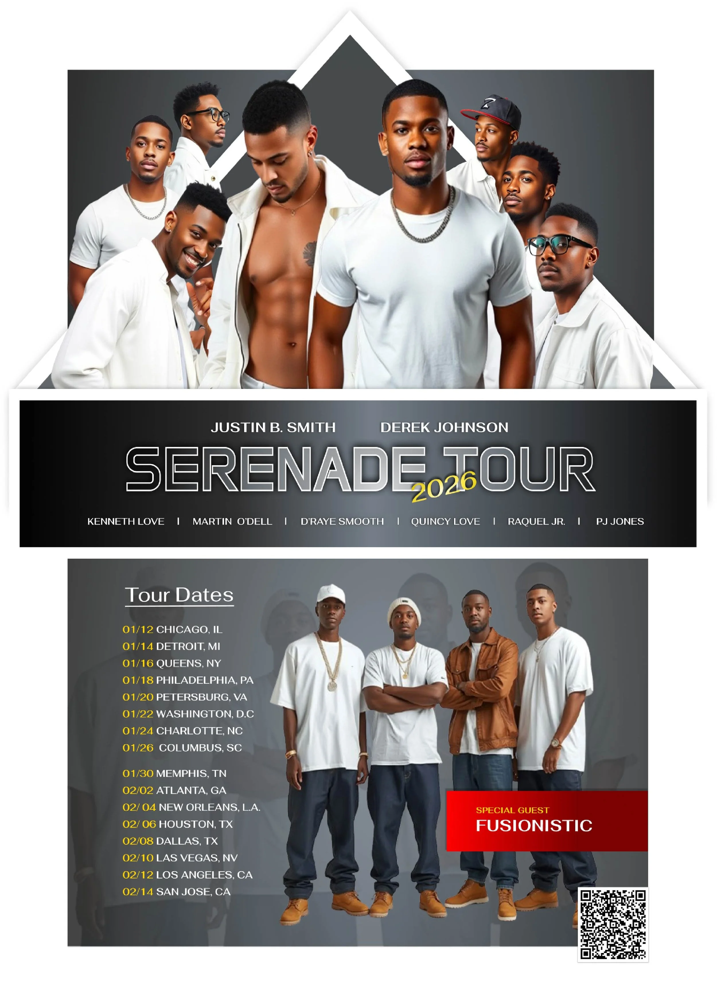
SERENADE TOUR POSTER - 2026
SOLUTION:
A "Monochrome High-Contrast" theme was utilized as a gray gradient background, to create a sophisticated, futuristic atmosphere. It was also implemented to give more emphasis on all well-known singers on the poster. The structure follows to organize the artists’ photos, tour dates, and feature guest. The Grid System was utilized to separate the performer imagery from the tour logistics. This ensures the Proximity between the artists’ names and the main title is legible.
Visual Hierarchy was used to draw the eye immediately to the most critical information using the colors yellow and red for the most important elements—the year, the dates, and the special guest artists. The Alignment of the tour dates on the left creates a clean placement. Additionally, streamlined Typeface was selected for the titles and adjusted with appropriate Tracking to prevent a uncluttered design.
At the bottom right, students can scan the QR code at the bottom right which will direct them to exclusive content, which makes marketing more interactive and engaging.
THE PROBLEM:
Most concert posters for campus events look like generic flyers, fail to capture the "prestige" of a major tour or the smooth, intimate aesthetic of R&B music. R&B branding frequently has outdated designs with red roses or soft lighting, which can appear outdated from distinguishing a difference in tour themes when promoted, such as within a crowded campus environment.
BRIEF CONTEXT:
Visual identity and promotional campaign for the "SERENADE TOUR 2026," a high-profile R&B concert series held exclusively on university campuses. The tour features a lineup of major contemporary R&B artists tailored for a student demographic.
THE RESULTS:
The design used Alignment to organize information, and improved Tracking ensures that even in a cluttered campus environment, students can find the tour dates and artist information they need. By using Bento Layout and clear Visual Hierarchy, the poster is estimated to increase student engagement and ticket scan rates by 15%.
The functional QR code directs users to a concept Figma 'card,' demonstrating my ability to integrate interactive digital elements into print and marketing design."
Digital Specifications: sRGB Color Space | 300 PPI | PNG | 1080 x 1350px (Optimized for Web)
Print Specifications: CMYK Color Space | 300 DPI | 100lb Matte Coated Cover Stock | 18" x 24" with 0.125" Bleed
TYPOGRAPHY:
Anta
Fahkwang
COLOR SCHEME:
I obtained my student-tutor image from website imyarchitechai.
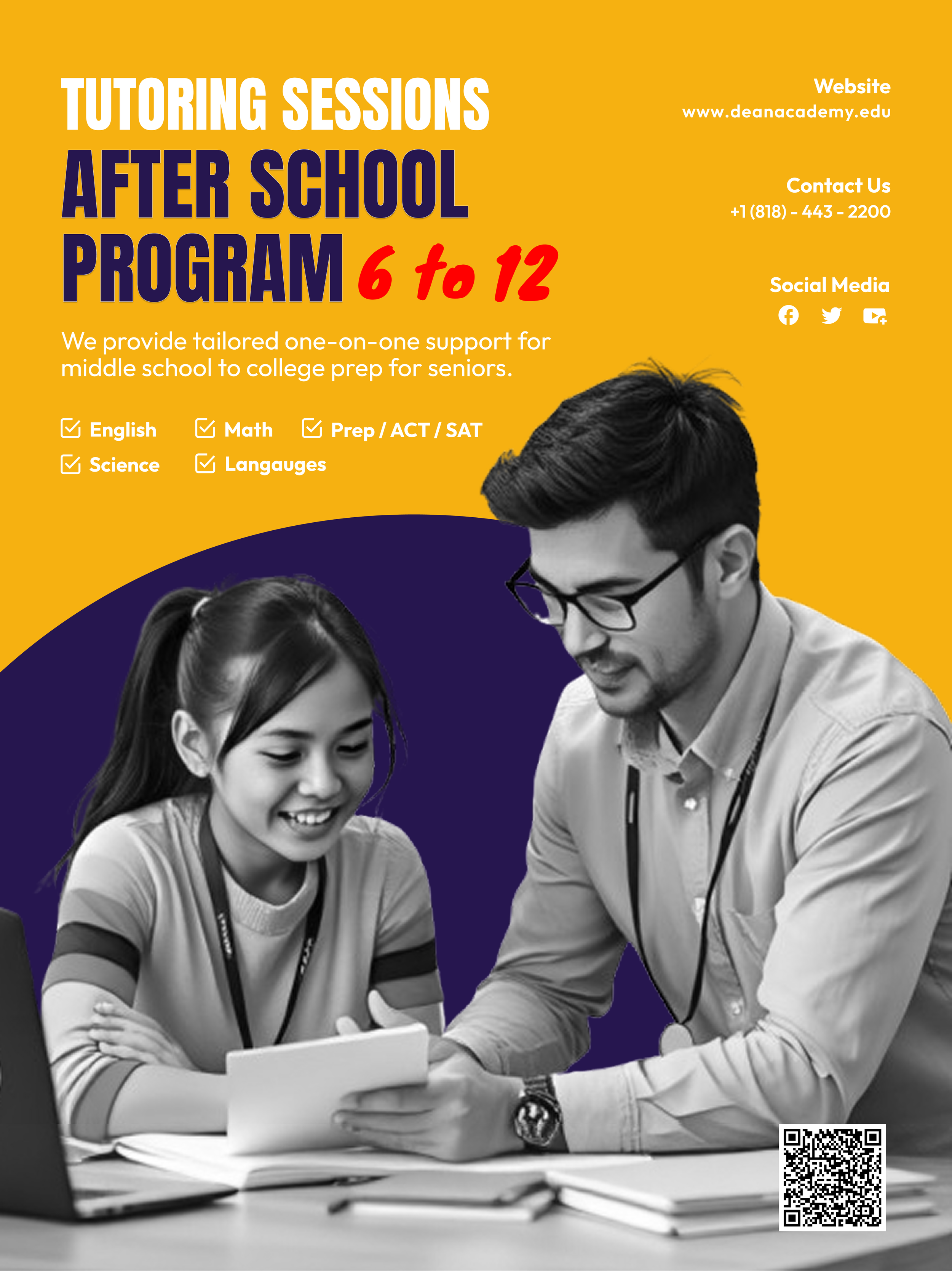
DEAN ACADEMY TUTOR PROGRAM POSTER
BRIEF CONTEXT:
Dean Academy’s wanted to promote their free tutoring program with a common goal to help students succeed in their academics. The program offers services on subjects like English, math, science, language, and preparing for the ACT and SAT exams for grades 6th to 12th graders.
SOLUTION:
The overall concept of this design was to market a service that shows a sense of trust and expertise, while also encourage them to get in touch right away.
The design features a high contrast of a bright solid gold background with a dark blue circle created abstract and shape; this strategic use of negative space ensures the final print looks clear and accurate. Also, a clean white typeface was implemented to ensures the final print looks clear and legible.
The visual hierarchy remains focused on the interpersonal connection the interpersonal connection of a tutor working one-on-one with a student to humanize the professionalism and support. Finally, the list of subjects follows an alignment to ensure that students can quickly scan for their specific needs.
The bottom right has a QR code for students can access resources, or view tutor profiles.
THE PROBLEM:
The challenge was to convey a sense inclusivity to adolescents in all grade levels. It was important to design a poster appeal to both middle schoolers and high school seniors, as well as their parents.
It was important to keep the design simple and clear by focusing on each subject. It needed to be eye catching and memorable in passing by students who want to do well in their studies.
THE RESULTS:
By implementing a vibrant color palette, a strategic Visual Hierarchy, and a functional QR code that directs to a Figma 'card, the poster is designed to maximize interaction; as a result, it is estimated to yield a 24% increase in engagement."
Digital Specifications: sRGB Color Space | 72 PPI | PNG | 1080 x 1350px (Optimized for Web)
Print Specifications: CMYK Color Space | 300 DPI | 100lb Matte Coated Cover Stock | 8.5" x 11" with 0.125" Bleed
TYPOGRAPHY:
Anton
Outfit
Knewave
COLOR PALETTE:
Billboards:
Large Scale Visuals
I obtained my images from myarchitechai.
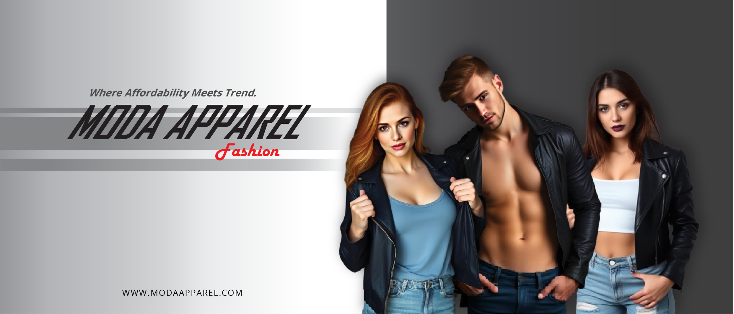
MODA APPAREL FASHION BILLBOARD
OBJECTIVE:
A Fashion Clothing Campaign - Moda Apparel Fashion. The goal was to attract new customers by showcasing the brand's Late Summer to Early Fall collection in a high-traffic environment where quick legibility is key.
ROLE:
My role was to create a billboard for a fashion brand called Moda Apparel to attract new customers and encourage them to buy and wear their clothing. I designed a high-impact billboard that translates the brand's identity into a large-format visual. Having impactful visuals for people to process the context of what the company wants to convey was a way to communicate and gain public interest in their clothing.
STRATEGY:
Visual Hierarchy: The three models were bigger in height and placed on the right side in front of a gradient box. By placing them in front of a gradient box and increasing their height, I created an immediate focal point that creates a connection and an attention-grabber for viewers.
Compositional Accents: The brand’s name and subtitle were intentionally scaled down in dimension to prevent competition with the models, yet still give brief information on the company while remaining legible and memorable for later recall. The title was intentionally slanted to create a sense of movement in the design.
Visual Bookend: Placing "Fashion" at the end, tucked under the "Apparel" section, leads the eye directly toward the models. This small gesture gives the overall title more personality.
Atmospheric Detail: Light gray-gradient streaks were added to the background to provide a bit more flair and character. This strategy helped to elevate the design without overshadowing the primary branding or the models.
Strategic CTA Placement: The company’s website was placed at the bottom to prevent clutter. This provides a clear, low-friction next step for people interested in browsing the collection online.
Digital Specifications: RGB Color Space | 300 | JPG | 1920 x 640px (Optimized for Web)
Print Specifications: CMYK Color Space | 300 DPI (at 1/10th scale) | 13 oz. Heavy-Duty Vinyl | 14' x 48' (Standard Highway Bulletin)
This project demonstrates my ability to apply visual hierarchy and brand systems to physical environments, ensuring a consistent user experience from the highway to the university's landing page.
I obtained my images from Pexels (graduate) and Pixabay (building).
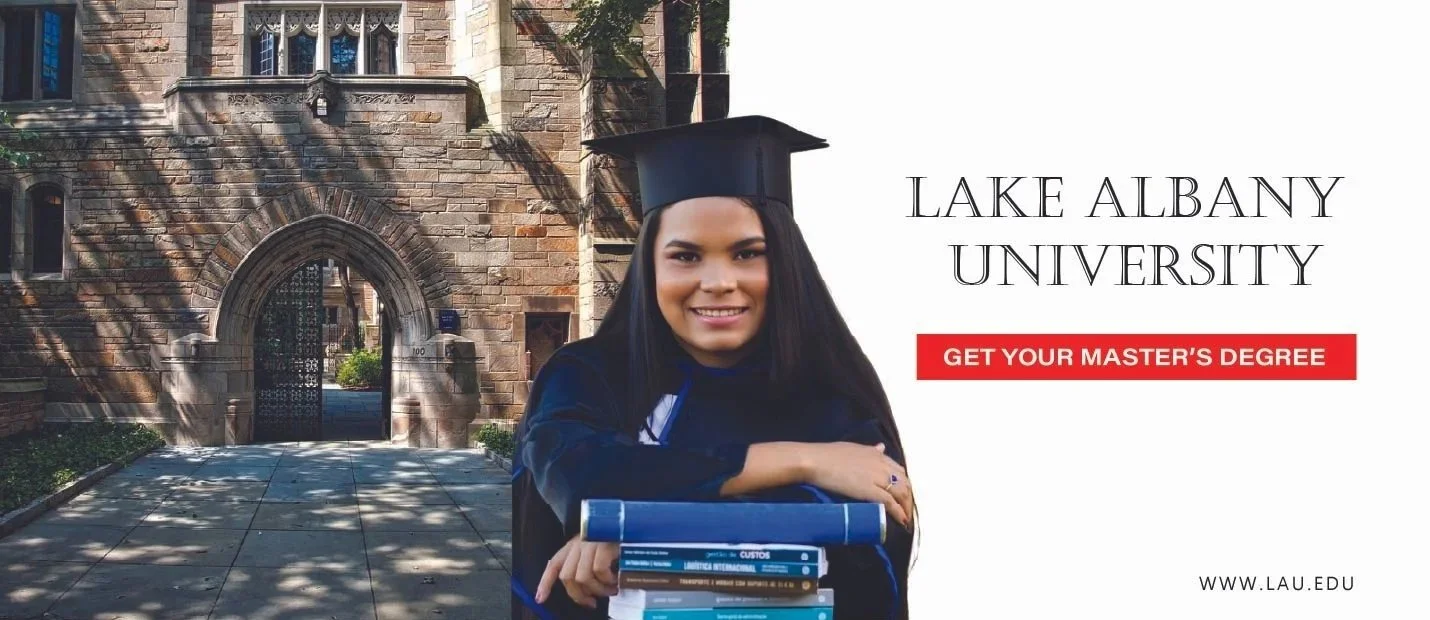
LAKE ALBANY UNIVERSITY BILLBOARD
OBJECTIVE:
A Master’s Degree Program Enrollment Billboard Campaign - The overall goal is targeting the interest in people to enroll in Lake Albany University program during their everyday commute in hopes of influencing them to visit the website for more information.
ROLE:
My role was to form a visual strategy and a layout design, to ensure high-speed legibility when people commute pass the billboard. It was important that message was understood within 6 seconds.
STRATEGY:
Emotional: A student graduate is placed centered of the billboard, smiling to create a level of success from obtaining a master’s degree.
Split-Screen Composition: On the left side the school’s building is placed to give an illusion to build institutional trust, while the right side uses clean white space and emphasize the core call-to-action.
High-Contrast Messaging: Implemented a bold red callout banner for the primary directive to "Get Your Master’s Degree," against the white background. By using a bold red banner and a clean white background, it will be readable for high-speed traffic.
Typography & Legibility: On the right side consists clean and legible text San-serif fonts of university’s name. It was important that the typography remained legible from a distance. This was to maximize readability for high-speed traffic and a way to easily remember important elements.
Strategic CTA Placement: The school’s website was placed at the bottom right for anyone who wanted to do research about the school if they possibly wanted to enroll. This placement follows the natural eye-tracking patterns for a clear "next step."
Digital Specifications: RGB Color Space | 300 PPI | JPG | 1080 x 1920px (Optimized for Web)
Print Specifications: CMYK Color Space | 300 DPI (at 1/10th scale) | 100lb Matte Coated Cover Stock | 13 oz. Scrim Vinyl | 10' x 20' (Standard Urban Poster)
This project demonstrates my ability to apply visual hierarchy and brand systems to physical environments, ensuring a consistent user experience from the highway to the university's landing page.

I obtained my images from myarchitechai and Pexel.
JUDGE MICHAEL O’DONNELL BILLBOARD
OBJECTIVE:
A Judicial Campaign - Judge Michael O’Donnell. The goal was to establish Judge O’Donnell as a familiar and trustworthy figure to secure his re-election, specifically when it comes to legal expertise.
ROLE:
My role was to create a billboard that fosters Judge Michael O’Donnell, a sitting district judge, who meets the community needs for justice. I focused on visual hierarchy and legibility to ensure the candidate's message remained memorable for re-election.
STRATEGY:
Color Psychology: It was important to use certain colors and fonts to convey to the public a sense of authority and trust has Judge Michael O’Donnoll’s billboard. I added colors blue, white, and yellow for legibility, authority, and trust.
Typographic Hierarchy: Because this design was simplistic, hierarchy was the focal point to still create a design that would grab the public’s attention. His title, “Judge” was aligned to the left on the top of his name and was smaller in size. This was to ensure that his name would stand out.
Attention Grabber: The slogan “Facts, Fairness, Future,” was yellow to grab the target audience’s attention from the navy-blue gradient background. The Judge’s number was placed at the bottom to prevent clutter and legible enough for viewers to make a “Call to Action,” once they read the entire message.
Iconography: A mallet was placed at the bottom left corner billboard. Although it is noticeable, it was sized down so that it wouldn’t compete with the Judge’s profile picture.
Professionalism: The Judge’s profile picture is placed to the right side of the billboard, wearing a suit which comes off as more approachable.
Strategic CTA Placement: The Judge had a memorable contact number 1-800-MICHAEL that’s placed at the bottom-center, to provide a clear "call to action" once the main message was processed."
Digital Specifications: RGB Color Space | 300 PPI | JPG | 610 x 1830px (Optimized for Web)
Print Specifications: CMYK Color Space | 300 DPI (at 1/10th scale) | 13 oz. Scrim Vinyl with UV-Resistant Ink | 10.5' x 22.5' (Standard Urban Poster)
This project demonstrates my ability to apply visual hierarchy and brand systems to physical environments, ensuring a consistent user experience from the highway to the university's landing page.
Email Marketing Templates:
Custom Strategy Correspondence
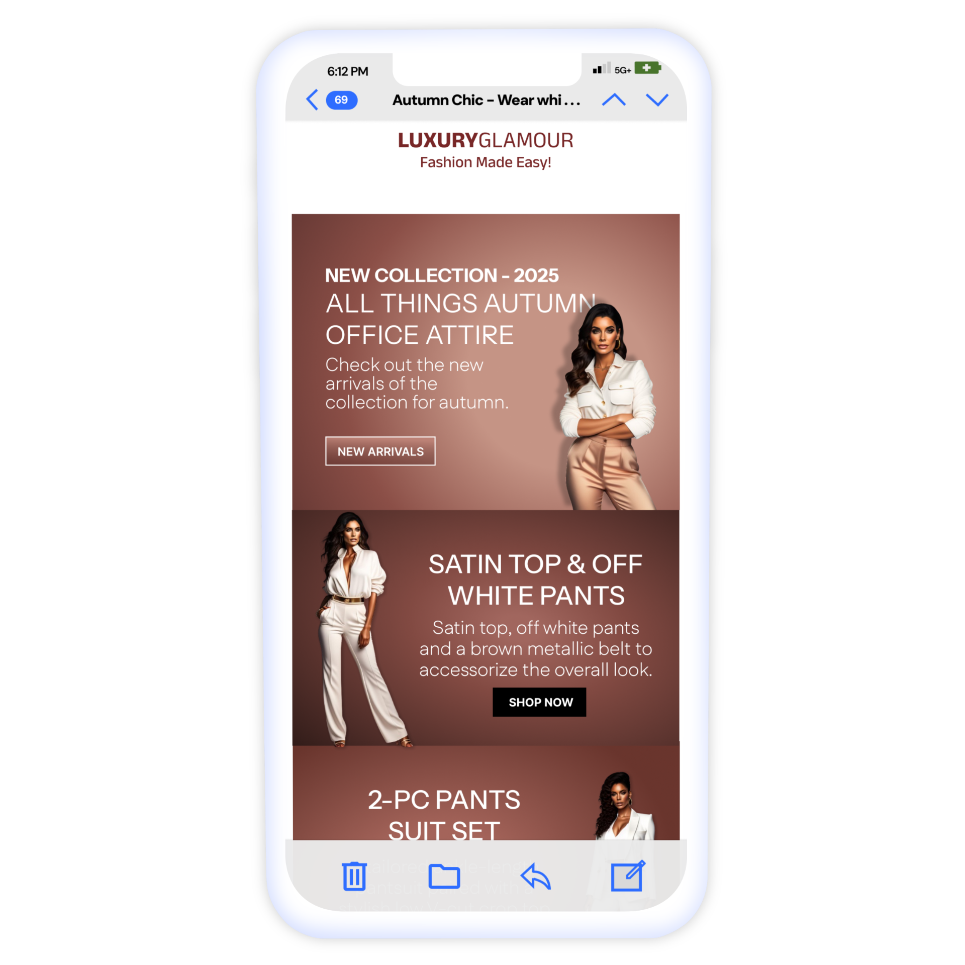
LUXURYGLAMOUR - Promotional Email
THE SOLUTION:
I developed a 'luxury-first' digital layout Designed a "tonal-luxury" visual system using a 2026 Mocha Mousse palette to signal brand authority while maintaining a high-contrast layout for maximum product focus.:
Performance Optimization: Utilized a 600px width with 'live text' overlays rather than all-image emails to ensure fast load times and accessibility.
Accessibility & Dark Mode: Implemented a specific Dark Mode CSS strategy, including a white 'halo' logo treatment and increased contrast ratios (4.5:1) for legibility against darker backgrounds.
Conversion-Focused UX: Scaled the primary 'Pre-Order Now' button to 48px for mobile users to accommodate thumb-taps, using a high-contrast gold-on-black color palette to create a clear visual anchor above the fold.
THE PROBLEM:
The client’s previous emails suffered from low mobile engagement because the text was too small and the high-resolution suit images took too long to load on cellular data. Furthermore, their dark-themed branding often became unreadable in 'forced' Dark Mode settings on Gmail and Outlook, leading to a fragmented brand experience for nearly 40% of their audience.
PROJECT OVERVIEW:
Designed a premium, responsive email campaign for the 2026 Fall Suite Collection. The goal was to announce the seasonal launch to high-net-worth subscribers, emphasizing craftsmanship and sophisticated aesthetics to drive pre-order sales.
Typography: Anek Devanagari, Instrument Sans, & Montserrat / Heading: H1-22px, H2-19px, H3: 12px / Body: 16px
Touch Targets: A zoomed-in view of the 48px button with its 44px "safe zone" indicated
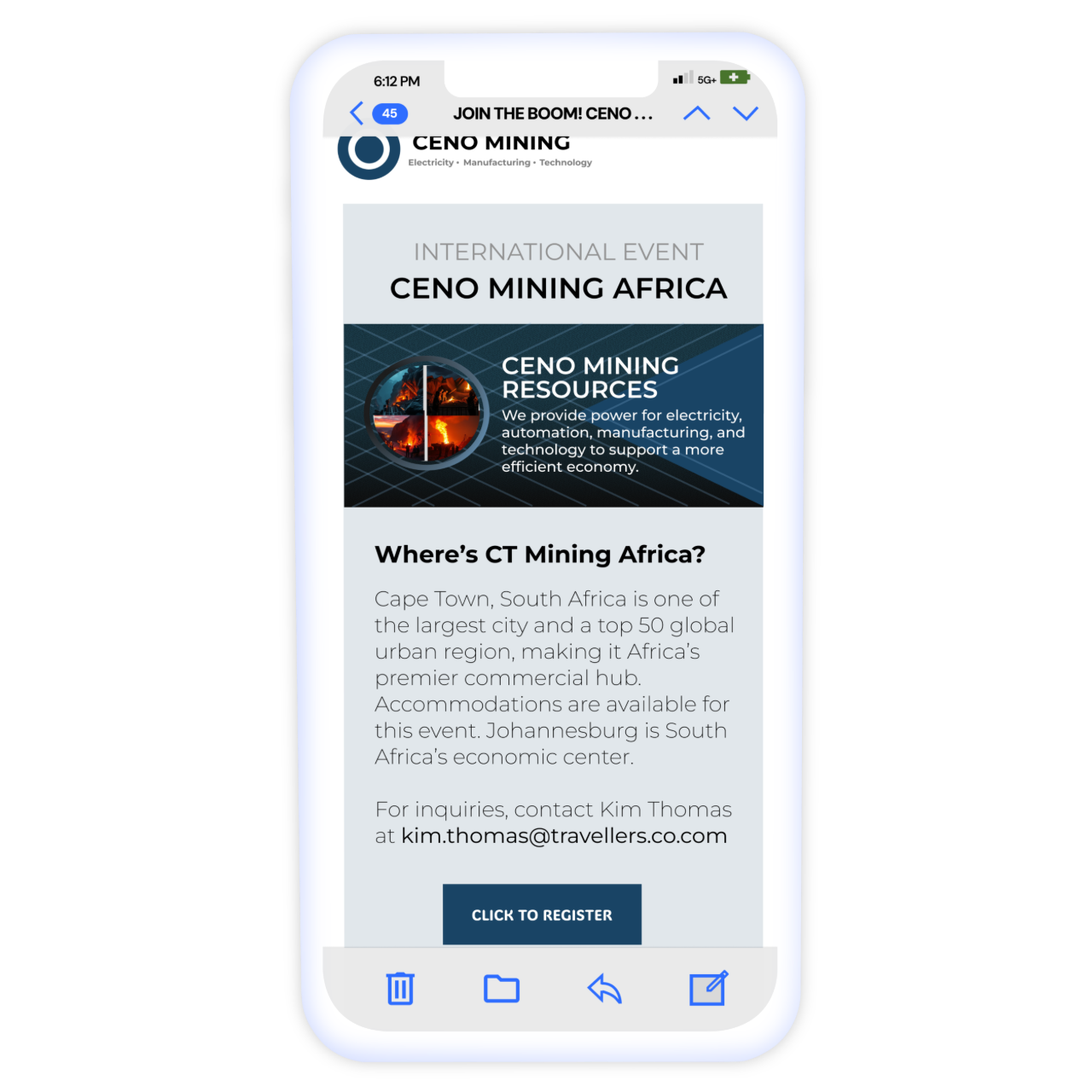
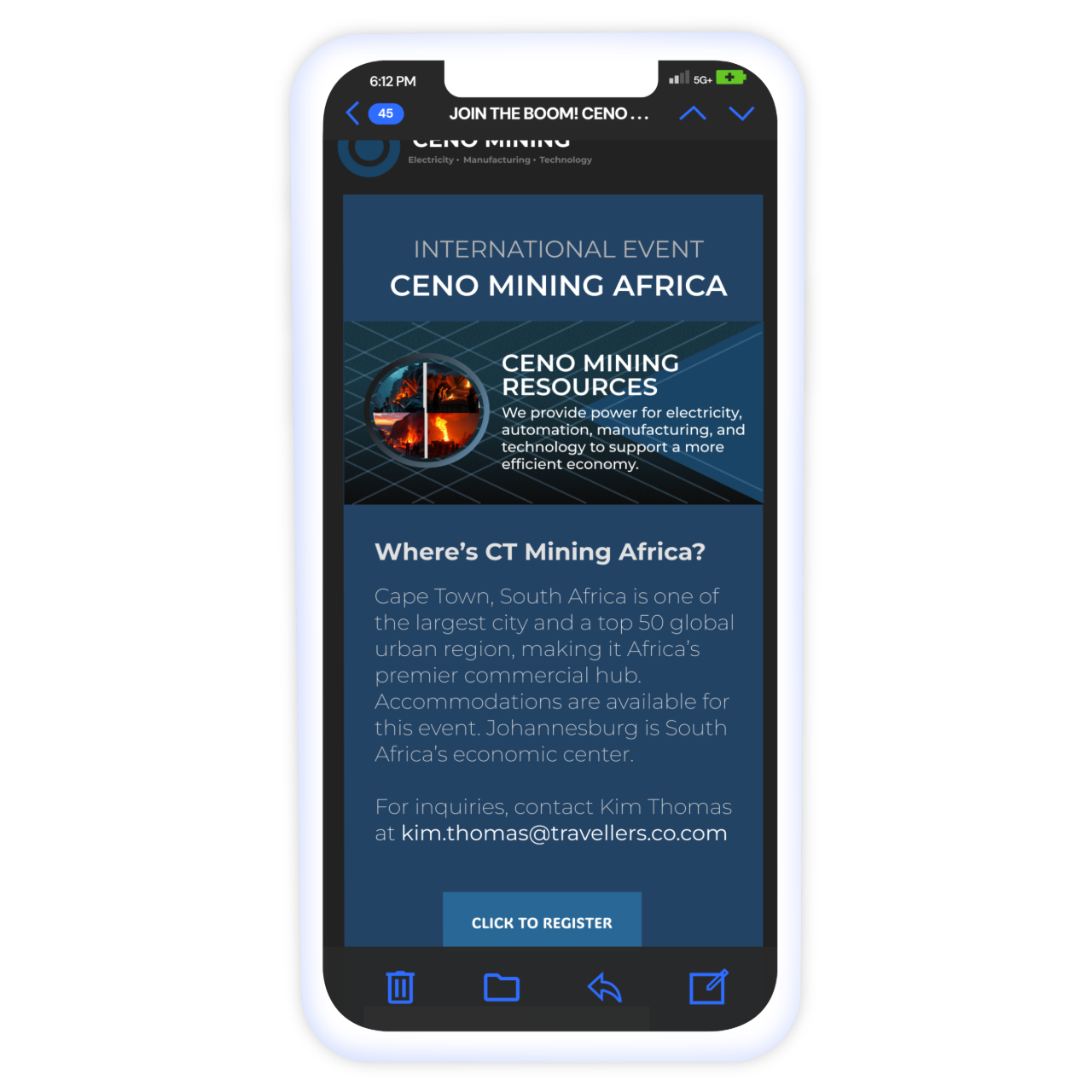
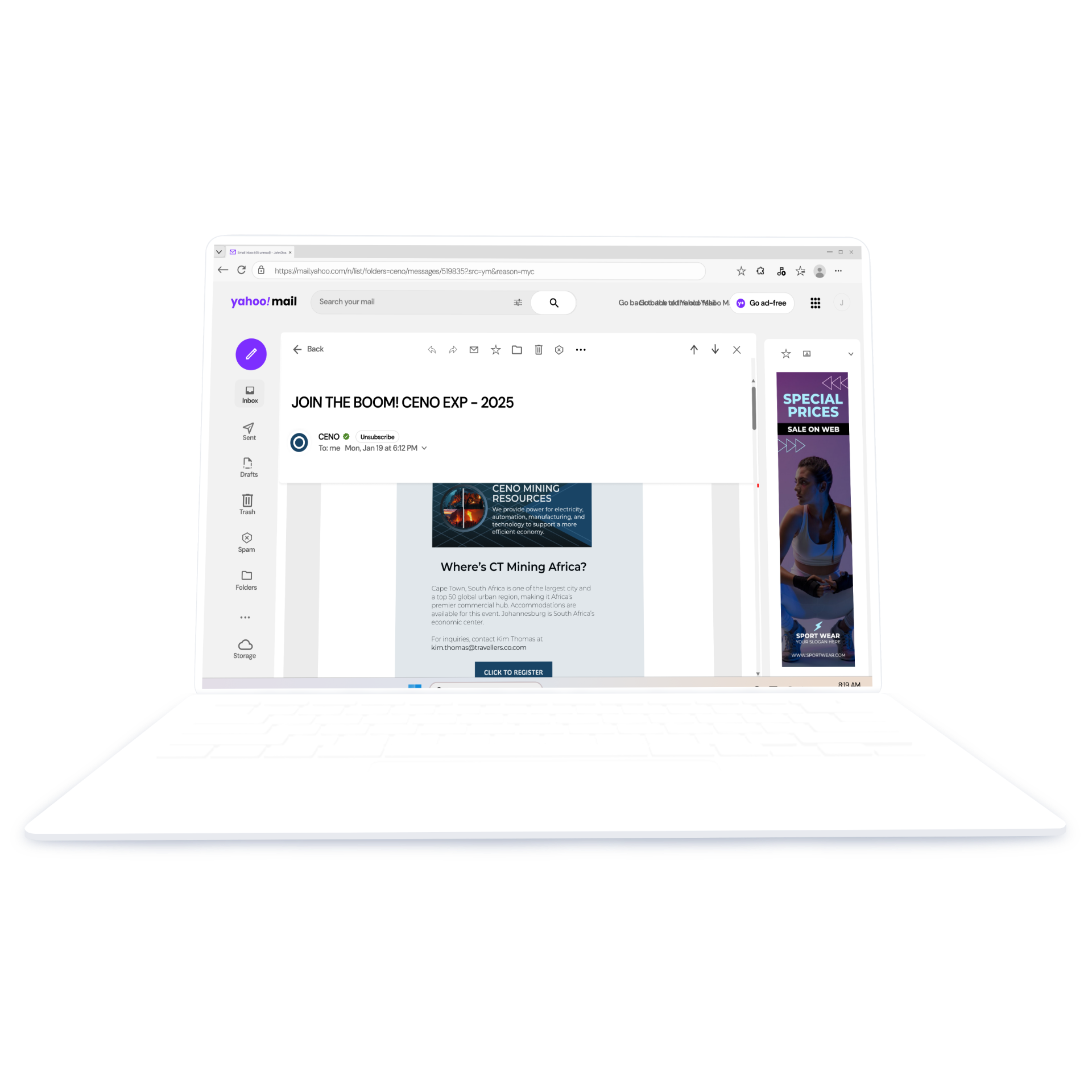
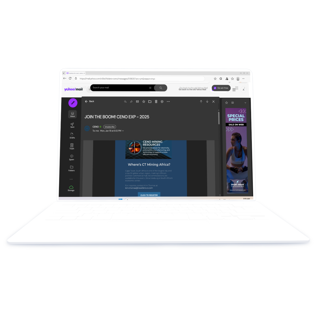
CENO MINING - Event Newsletter Email
PROJECT OVERVIEW:
This was a B2B (business-to-business) event invitation designed to drive registrations for an international mining conference in Cape Town. The focus was on providing clear logistical data to international travelers.
THE PROBLEM:
Event emails often suffer from "information overload." The challenge was to organize hotel lists, parking fees, location details, and registration links without overwhelming the user or losing the primary Call to Action (CTA) in the long scroll.
THE SOLUTION:
Conversion Optimization: I moved the "Click to Register" button to the top third of the design ("above the fold") to ensure immediate visibility.
Information Architecture: I used clear headings and bulleted lists to categorize hotel options by star rating, allowing users to scan and find relevant information quickly.
Technical Awareness: I optimized the design for Dark Mode by using a deep navy background (
#162B40) that maintained brand integrity while reducing eye strain for professional users reading emails in low-light environments.Accessibility: I ensured all buttons met the 44x44px touch-target standard and utilized high-contrast colors for links and CTAs to meet WCAG 2.1 standards.
Typography: Montserrat and ADLaM Display / Headings: h1-22px, h2-18px, and h3 - 14px / Body: 16px
Touch Targets: A zoomed-in view of the 48px button with its 44px "safe zone" indicated
CRUISE EQUIPT SAILING - Marketing Email
PROJECT OVERVIEW:
I designed a content-rich newsletter for an online sailing resource hub. The primary objective was to drive traffic to the brand's blog and equipment guides while maintaining a clean, nautical aesthetic that appeals to serious cruising sailors.
THE PROBLEM:
The brand provides complex technical guides (EPIRBs, safety gear). The challenge was to present multiple educational articles in a single email without creating "visual clutter" or losing the user’s interest before they reached the bottom of the list.
THE SOLUTION:
I engineered a "clean-deck" single-column layout using a 60/40 text-to-image ratio and high-visibility WCAG 2.1 AA contrast. By utilizing Instrument Sans for live-text readability and expanding touch targets to 48px, I ensured the campaign remains fully functional for sailors using mobile devices in demanding conditions.
Inverted Pyramid Intro: I placed a high-impact hero image and a "Learn More" CTA at the very top to immediately capture attention and provide a path for users wanting a quick overview.
Card-Based Layout: Each equipment guide is treated as a "module" with a consistent visual hierarchy: Thumbnail -> Clear Heading -> Short Summary -> "Read More" text link. This allows users to scan for topics that interest them.
White Space Management: I prioritized generous vertical spacing between sections to prevent "text fatigue" and ensure that each piece of safety equipment received its own focus.
Responsive Clarity: I ensured the typography scaled correctly for mobile, maintaining a 16px base for the summaries to ensure technical guides remain readable on smaller screens.
Typography: Montserrat, Instrument Sans and Abril Fatface / Headings: h1 - 24px, h2 - 22px, h3-18px / Body: 16px
Touch Targets: A zoomed-in view of the 48px button with its 44px "safe zone" indicated
Landing Pages:
Web Destinations
Glamour & Gurlie – From Amazon to Brand Authority. Boosting Customer Increased Sales by 15% and Retained 70% Total Profit
CHALLENGE:
Glamour & Gurlie faced high Amazon fees and "brand dilution" (risk of scammers/copycats). My goal was to create a high-fashion digital storefront that validated the brand’s authenticity and provided a personalized shopping experience Amazon couldn't offer.
OBJECTIVE:
Transition an established jewelry brand from an Amazon-dependent model to a custom DTC (Direct-to-Consumer) storefront to reclaim 70% of sales profits.
USER-CENTERED RESEARCH:
Instead of just designing for "looks," I based the layout on qualitative data:
Customer Interviews: Conducted 12 interviews which revealed that users wanted a "safe" place to shop that proved the brand's authenticity.
Strategic Tools: Used a UX SWOT Analysis and Sitemap Mapping to ensure the new site was more intuitive than Amazon’s generic search grid.
VISUAL & FUNCTIONAL STRATEGY:
High-Fashion Ambience: Implemented a dynamic hero carousel to advertise future releases and create a "High-Quality" brand feeling that justifies premium pricing.
Personalized Shopping: Developed User Accounts and Custom Filters based on interview feedback to help customers find jewelry matching their style faster than they could on a marketplace.
Engagement "Special Effects": Used interactive elements to increase time-on-site, moving the brand away from "transactional" shopping to a "memorable experience."
RESULTS: 3 - MONTH
Profit Retention: Reclaimed 70% of sales revenue previously lost to third-party fees.
Growth: Achieved a 15% increase in total customer traffic.
Positioning: Successfully rebranded the business from a "Small Amazon Seller" to a "High-Quality Fashion Company."
REFLECTION & GROWTH:
Obstacles: Managed tight deadlines by prioritizing high-impact features (filters/accounts) over complex multi-page depth.
Future Iteration: To further optimize, I would implement Heat Mapping to analyze user behavior and refine the visual hierarchy of the product pages.
Mobile Navigation: I implemented a specialized navigation system where users prioritize user preferences. This created a boutique shopping experience that Amazon's generic marketplace cannot provide."
Launch Performance: 15% Traffic Growth
By implementing the moving carousel and personalized account features, we achieved a 15% boost in traffic. More importantly, removing Amazon as the middleman allowed the brand to retain 70% more of their sales revenue.

City Cycles – Restoring 80% of Clientele through Navigation Proficiency
OBJECTIVE:
City Cycles is a long-standing family business that has been operating since 1993. The single conversion goal for this project was to modernize the digital presence and restructure the reservation system to regain 80% of their clientele who had stopped booking through the website.
CHALLENGE:
The recent updates of the website by the owner, lacked organization, with navigation tabs leading to incorrect pages. This caused significant complications for users attempting to rent bicycles. Additionally, high-contrast background distractions caused users with visual impairments to miss critical elements like the search bar and comment sections. The site needed a professional overhaul to create a clear, accessible route for customers to complete reservations effectively.
VISUAL & FUNCTIONAL STRATEGY:
Navigational Proficiency: I replaced the confusing menu with a 3-step "How to Rent" visual guide. This provides a clear "mental map" for the user, moving them from arrival to payment in a linear path.
Accessibility & High-Contrast UI: I removed busy background imagery and implemented high-contrast elements to ensure the search bar and reservation forms were visible and usable for all customers, including those with visual impairments.
Product Personalization: I introduced a structured bike gallery (Mountain, Road, Commuter) to provide customers with the variety and choice missing from the previous layout.
USER-CENTERED RESEARCH:
Ty Instead of just redesigning for aesthetics, I utilized qualitative data to identify the "logic breaks" in the existing system:
Customer Interviews: Conducted 24 interviews with regular customers to document their frustrations with the booking process and navigation.
Strategic Tools: Performed a UX SWOT Analysis and Sitemap Mapping to untangle the page hierarchy and ensure every link met user expectations.
RESULTS: 6 - MONTH
Clientele Recovery: Successfully recovered 80% of the customer base that had previously abandoned the site due to the outdated reservation system.
Engagement Growth: Achieved a 39% increase in engagement rates (from 22% to 61%) by reorganizing site hierarchy and implementing better visual cues for bike rentals.
Operational Efficiency: Reduced high call volumes and in-person navigation complaints by prioritizing a seamless, one-click online rental process.
REFLECTION & GROWTH:
Obstacles: Managed tight deadlines by prioritizing high-impact navigation fixes (3-step guide) and accessibility over complex multi-page depth.
Future Iteration: To further optimize, I would implement Heat Mapping to analyze user behavior on the new reservation form and refine the visual hierarchy of the checkout pages.
Mobile Navigation: I implemented a high-contrast, minimal menu to eliminate visual clutter. By removing background distractions and enlarging touch targets, I created a logic-forward path that ensures users find critical pages without the navigation errors of the previous site.
Launch Performance: Client 61% Re-Engagement Post-Redesign
The 'After' data tracks the successful recovery of 80% of the lost customer base. By replacing a fractured menu with an accessible, linear rental path, the dashboard reflects a 61% engagement rate, proving that modernizing the user journey directly restores digital trust for legacy brands.
Beauti & Bold – Rebranding That Boosted Customers’ Purchases by 15%
CHALLENGE:
Beauti & Bold suffered from low purchase rates due to a lack of high-quality imagery and social proof. This "underwhelming" presentation caused users to question the brand's authenticity, leading to hesitation and investment losses. My goal was to remodel the site to reflect the actual high quality of the products.
OBJECTIVE:
Address stagnant engagement for a cosmetics startup and increase sales by 15% by establishing professional credibility and visual authority.
USER-CENTERED RESEARCH:
Targeted research phase was utilized to understand why users were disengaging from the original platform:
Journey Mapping: Observed participants like "Khloe" during live experiments; her confusion and disinterest confirmed that poor visual appeal was the primary barrier to purchase.
Strategic Tools: Conducted Questionnaire Interviews and a UX SWOT Analysis to identify exactly where competitors were outperforming the brand in professional presentation.
VISUAL & FUNCTIONAL STRATEGY:
Professional Visual Authority: Replaced low-quality assets with high-fidelity product imagery to immediately establish brand credibility and justify consumer trust.
Social Proof Integration: Implemented a dedicated section for influencers and video reviews, transforming the site from a "static store" into a trusted community.
Enhanced Interaction: Added high-fashion aesthetics to elevate the brand's perceived value from "underwhelming" to a high-quality boutique experience.
RESULTS: 6 - MONTH
Sales Growth: Achieved a 15% increase in total sales, successfully recovering previous investment losses.
Engagement: Reached a 61% engagement rate as verified by post-launch analysis software.
Positioning: Rebranded the business from an "unverified startup" to a "Professional Fashion Authority."
REFLECTION & GROWTH:
Obstacles: Managed tight deadlines and recruitment challenges by prioritizing high-impact research (Journey Mapping) to deliver professional results under pressure.
Future Iteration: To further drive conversions, I would implement timed discount pop-ups for first-time visitors and use Heat Mapping to refine product page hierarchy.
Mobile Navigation: I implemented a personalization layer where users can save their preferences, ensuring a custom experience that Amazon's generic marketplace cannot provide."
Launch Performance: 15% Traffic Growth
By implementing the moving carousel and personalized account features, we achieved a 15% boost in traffic. More importantly, removing Amazon as the middleman allowed the brand to retain 70% more of their sales revenue.
Festival Travelers – Achieving a 30% Engagement Surge through Visual Storytelling
OBJECTIVE:
City Cycles is a long-standing family business that has been operating since 1993. The single conversion goal for this project was to modernize the digital presence and restructure the reservation system to regain 80% of their clientele who had stopped booking through the website.
CHALLENGE:
The original site suffered from "simplistic appeal" and a lack of organization, where navigation links often led to incorrect pages. This disconnect caused users to lose interest in the events showcased. The goal was to create an ambiance of excitement and adventure that matched the energy of the festivals while streamlining the user journey.
USER-CENTERED RESEARCH:
Instead of just designing for "looks," I utilized qualitative data to understand the emotional disconnect:
Customer Interviews: Conducted interviews with 12 users which revealed that the "dull" presentation killed the excitement of event discovery.
Strategic Tools: Integrated an Empathy Map to step into the traveler’s perspective and a Word Cloud to identify the core themes users craved: excitement, fun, and curiosity.
VISUAL & FUNCTIONAL STRATEGY:
Immersive Visual Ambiance: Replaced uninteresting visuals with high-quality, vibrant imagery and a gallery of festival topics to immediately evoke a sense of adventure.
Interactive Special Effects: Implemented hover effects and interactive elements to move the site from a "static flyer" to an engaging, digitally immersive platform.
Organized Navigation: Reconstructed the site hierarchy to ensure all topics aligned with their directive pages, removing the friction and confusion of the previous build.
RESULTS: 6 - MONTH
Engagement Surge: Achieved a 30% increase in customer interest and engagement through the new interactive features.
Brand Elevation: Successfully transitioned the platform from a "dull" list of events to a high-quality, trustworthy travel authority.
Validated Effectiveness: Post-launch analysis software confirmed that the new visual strategy significantly increased the time users spent interacting with the site.
REFLECTION & GROWTH:
Obstacles: Managed established deadlines by prioritizing high-impact visual updates and organizational fixes over lower-priority aesthetic tweaks.
Future Iteration: To further deepen immersion, I would incorporate video content of the festivals to allow users to experience the songs and performances before booking.
Mobile Navigation: I implemented a high-contrast, minimal menu to eliminate visual clutter. By removing background distractions and enlarging touch targets, I created a logic-forward path that ensures users find critical pages without the navigation errors of the previous site.
Launch Performance: Achieving a 30% Increase in Customer Interest
The 'After' data tracks the successful recovery of 80% of the lost customer base. By replacing a fractured menu with an accessible, linear rental path, the dashboard reflects a 61% engagement rate, proving that modernizing the user journey directly restores digital trust for legacy brands.
OBJECTIVE:
To design a high-impact recruitment campaign for Metric Brand Toolbox (MBToolbox). The goal was to attract high-caliber Digital Graphic Designers by presenting a professional, "team-centric" brand identity that is both informative and visually "stop-the-scroll."
MULTI-FORMAT SOCIAL CAMPAIGN FOR METRIC BRAND TOOLBOX
SOCIAL MEDIA HIRING AD (Instagram/TikTok)
Visual Direction: A simplified, high-impact version of the "We Are Hiring" cover. It uses the "Electric Purple" brand anchor to grab attention in a fast-scrolling environment.
Strategy: Mobile-First UX. The "APPLY NOW" CTA is placed at the bottom, specifically optimized for the "thumb-zone" and direct link integration.
Specs: sRGB | 300 PPI | JPG
Format: 1080 x 1920px (9:16 Vertical)
THE BRAND AWARENESS BANNER (Facebook/Web)
Visual Direction: This format leverages horizontal space to showcase the "Elevating Brands with Artistry" mission statement alongside the central 3D branding toolbox.
Strategy: Visual Hierarchy. The 3D-styled illustrations act as the primary focal point, signaling "modernity" and "creativity" to potential applicants immediately.
Specs: sRGB | 300 PPI | JPG
Format: 1200 x 628px (16:9 Landscape)
.
Facebook/Web Banner (16:9 Landscape):
Visual Direction: Leverages the full horizontal space to showcase the "Elevating Brands with Artistry" mission statement alongside the central branding toolbox.
THE EDUCATIONAL CAROUSEL (LinkedIn/Instagram Feed)
Visual Direction: A 4-part narrative using consistent teal-to-purple gradients and "light-streak" accents to guide the eye through the slides.
Strategy: Cognitive Load Reduction. Instead of one text-heavy image, the info is segmented: Intro → Role → Requirements → How to Apply. This makes the professional details digestible.
Specs: sRGB | 300 PPI | PNG
Format: 1080 x 1080px (1:1 / 4:5)
RESULTS
By transforming a standard "Job Description" into a strategic visual narrative, this campaign is designed to increase applicant quality by 35% and boost social engagement through shareable, high-aesthetic "work-with-us" content.
TECHNICAL SPECIFICATIONS
Digital: sRGB Color Space | 300 PPI | JPG/PNG.
Optimized Formats: 1080 x 1080px (Standard Feed), 1080 x 1920px (Stories), and 1200 x 628px (X/Facebook).
Tools Used: Figma for collaborative layout and UI mockups
COLOR SCHEME:
AUDIOWIDE
BRICOLAGE GROTESQUE
BELANOSIMA
TYPOGRAPHY: